Project
Sopa de Sapo
Description
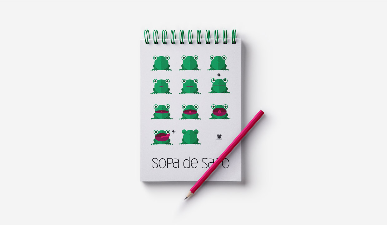
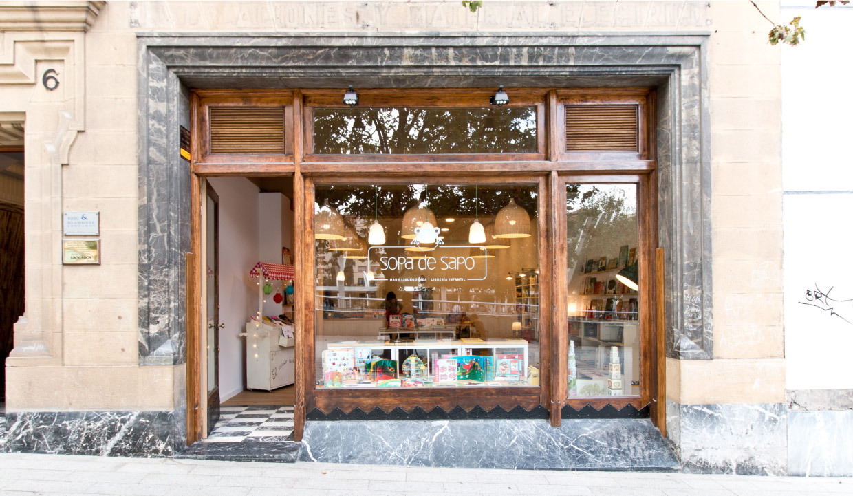
Brand identity for Sopa de Sapo children's library. We created this little toad and give him a life. Its childish and friendly image is attractive for both children and parents.
DEIBI by Wete&Ultratypes. With childlish and informal style, it’s positiveness matches perfect with the frog character. ultratypes.com
SOURCE SANS PRO. Works in the logo and outside of it, as corporate typeface and webfont. fonts.google.com
Credits
Role: Brand Concept Development, Graphic Design, Art Direction.
Made along with Maria Berga.
DATE
2014


